Why are we Zapal?
What about logo, color and style & some spicy stories

Welcome to our brand sharing
Hey-y we can see the interest burning in your eyes to know what we are even gonna tell you about. Is it another article about the mysterious influence of colors on people’s brains?
Is this about us explaining how red is the color of attention? Or why is style important for a brand, because it’s way obvious to us. Still, what we will actually share with you is our vision for all of these topics. We truly believe sharing is caring, and we wanna tell you our story, our “why's” of choices for naming, color, and logo.
Maybe one day you will create your own company and this article will help you. Saying no more, let's start with our first story tell in our blog!
Back to the roots: Why are we “Zapal”?
Well, as you know, we are a Ukrainian IT company. When our founders were creating Zapal, they wanted to express their roots in the naming. So the idea was to create something vivid, but precise, simple but senseful. We needed a name that would produce powerful feelings and clear images in mind about the energy we translate, a word that clearly reflects the company, vision, and our style.
Why, actually, have we chosen “Zapal”? You might not know, but in Ukrainian, “Zapal” means fuse. So no jokes, when we say it’s about us igniting the projects we create.
As a result, our perfect naming is one unique word that shows the way we are empowered with our projects.
Why would an IT-company pick lighting as a logo?
Thank you for asking, LOL! We’re honestly so excited to share this with you. When the idea of founding our company was on fire and the time to create the logo came — we had no doubts of us creating something specific, remaining the connection with the IT identity.
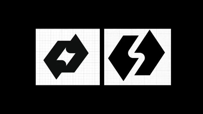
So, as you may have already guessed, the logo you may see now came from the combination of angle brackets with slash </>. This sign is frequently associated with Front-end development, and actually this is what Zapal was specialized in at the very beginning. Well, then we’ve realized that we do not want to be so basic. We also wanted to translate our passion and energy in our logo. Thus, we’ve decided to use the combination of </> with lightning.

Yep, we did it. Sure, there were several versions of the logo before we got to the final, our lovable one. You may see a few of them down below.


Well, that’s the story we’re proud of. We needed a logo that could translate our passion and energy in IT & we did it. Now our CEO — Ron can enjoy it every day, and we hope you, too, especially now, when you know its meaning!
What’s up with colors?
You might have wondered why an IT company would choose the main colors of theirs — red/orange and black. Usually tech companies select something more calm, trustful, right? Like, let me guess, the blue one. Studies used to say this is the color of calmness. Let me tell you a secret: there were proposals to make this color as our main one due to the color psychology.
At the very beginning there were three co-founders of Zapal, the one that is no longer in our team was the one insisting on blue. (Btw, It wasn’t the reason we stopped working together.) Still, the point in this story is “WHY?”. Why did we decide what we picked, what was our special motivation for each of the colors? Yeah, and what were we driven by.
We didn’t want to use any unconscious tricks or color psychology to “hack your brain”. It is far opposite to Zapal’s motivation, principles. We are creating our branding and reputation with the projects and high-quality results, not just relying on the “color theory”.
Zapal is about being empowered by ideas, teamwork, and beliefs in exceeding our client’s expectations. We’re ready to prove our expertise with that, we already do.
Well, lots of serious talks in here. Let us just mention some specific points of choosing this or that color and how we fulfill the idea of theirs in Zapal.

Black — We will not even mention this to be the favorite color of our Founder. We even had our jokes about dressing-up at our partners' event in “total black” looks. The joke went out of control, when all of us for real came all in black. Dream team! Additionally, all the people who love black modes on web pages would understand our love for these colors. Especially all IT-specialists, who spend dozens of hours next to the screens, appreciate us caring for their eyes.
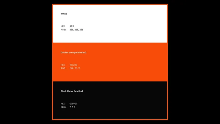
We also picked two more specific brand colors — orange and red. Actually, as you might have noticed the orange is, well, the main one of Zapal’s palette. As it’s totally representing our flaming power, energy, and clear & warm communications. Still, as we’ve chosen two bright colors, it was needed to the harmony of the color combination for our branding. Red and orange are catchy, and igniting. While black helps us to remain calm and strict, expertise, expressed in our style.

Final logo & brand colors for Zapal.
What’s now?
Our team has opened this door for you. The one that is full of our passion, motivation, and love for what we create and how we work. Zapal is not about being basic or simple, we are about thinking deeply, judiciously and creatively. It’s what drives us working with the best project, clients and delivering the utmost results. It’s what we hope inspires you, too.